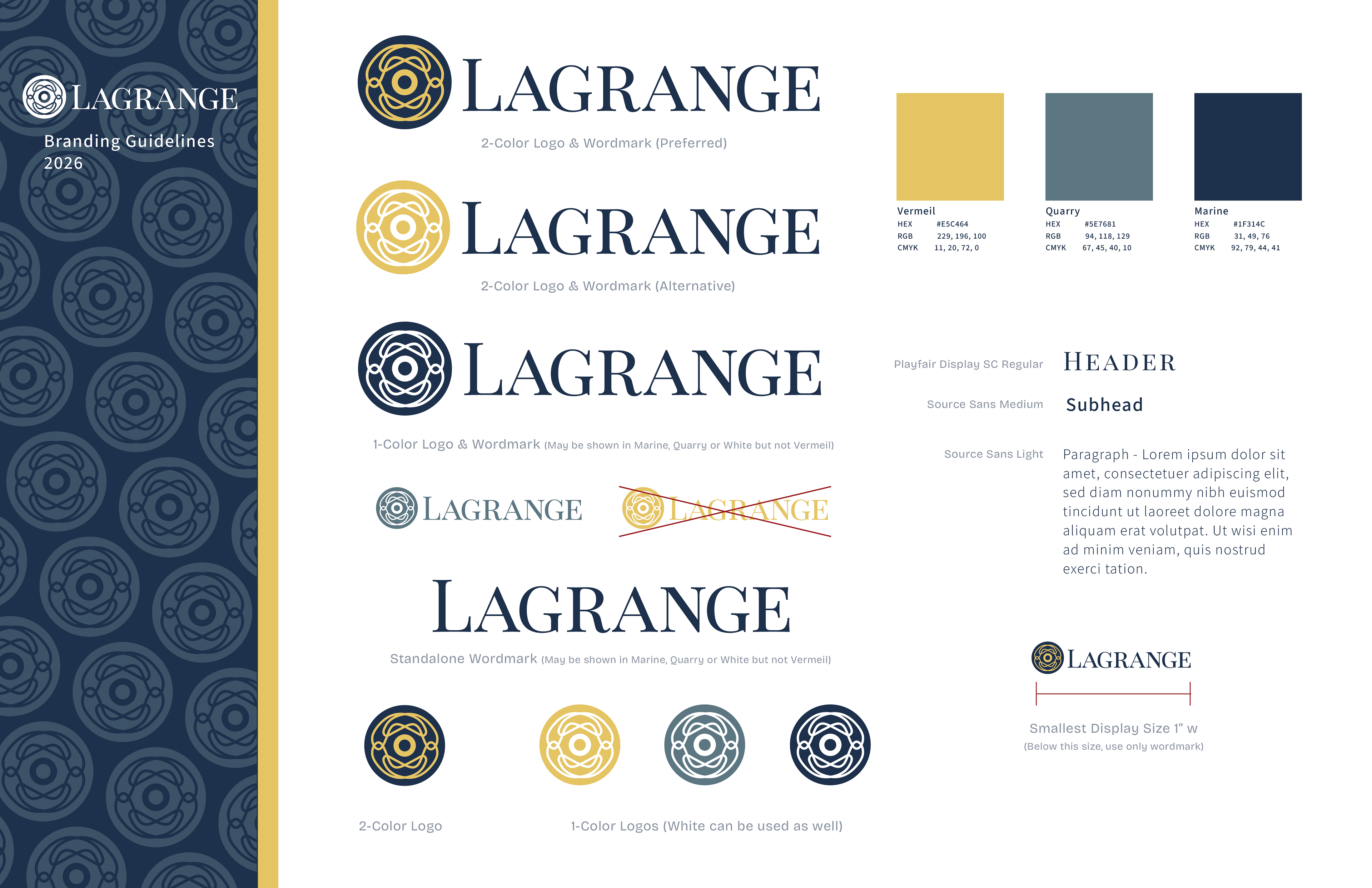
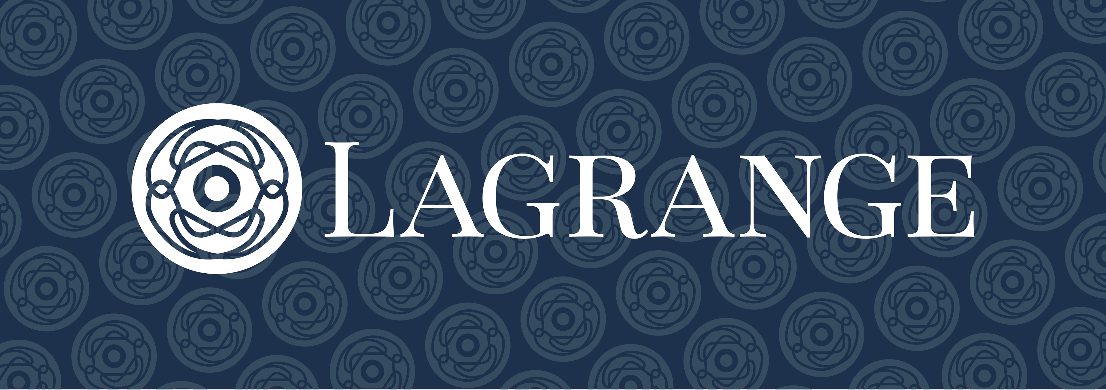
LAGRANGE
A former client approached me to create a brand and identity system for a primarily French venture capital firm that sought to draw on technology and life sciences research emerging from French and European universities and turn that research into viable startups. They had an idea of colors and typography they wanted to use, but were open when it came to the brandmark.
INITIAL EXPLORATION
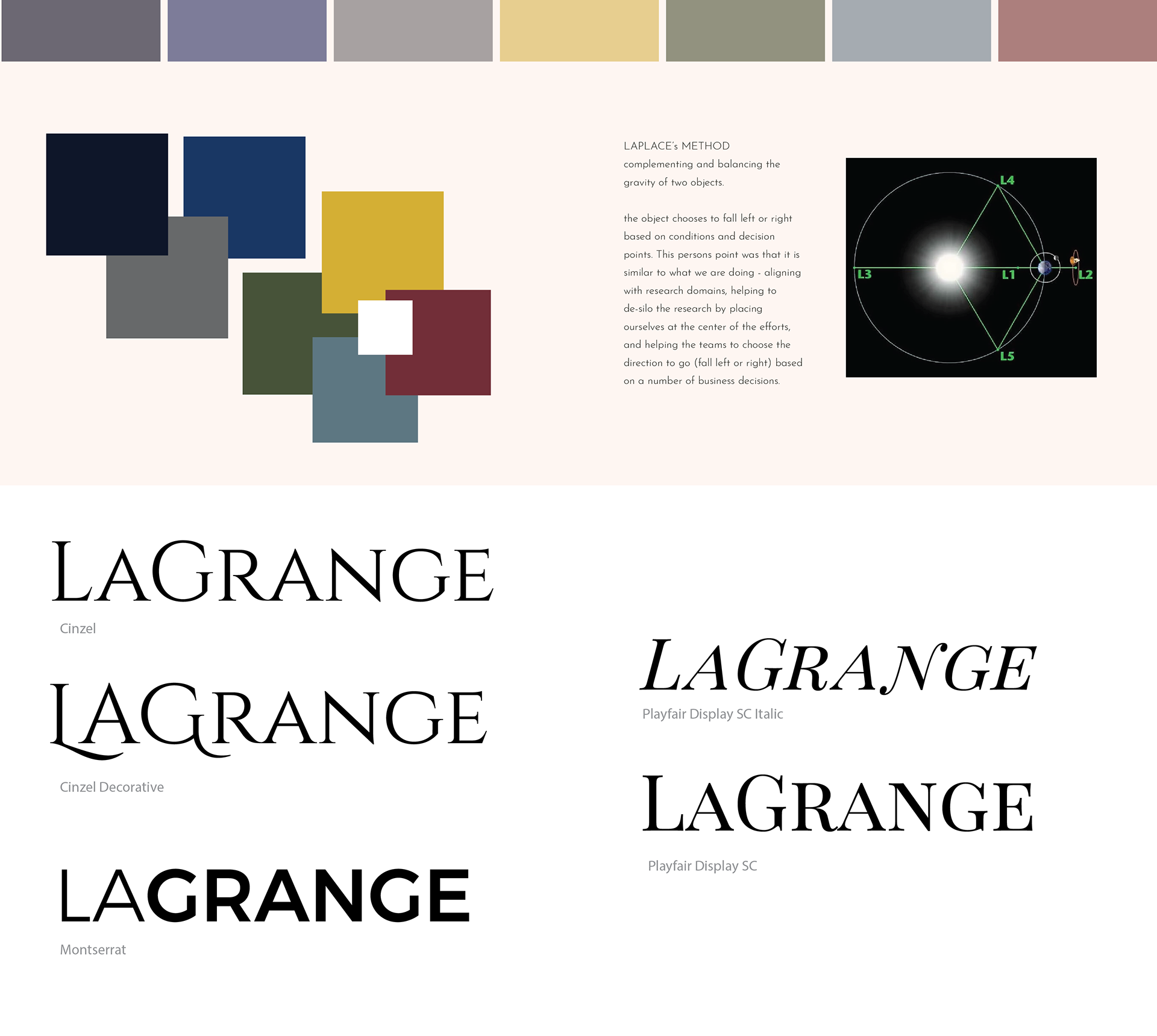
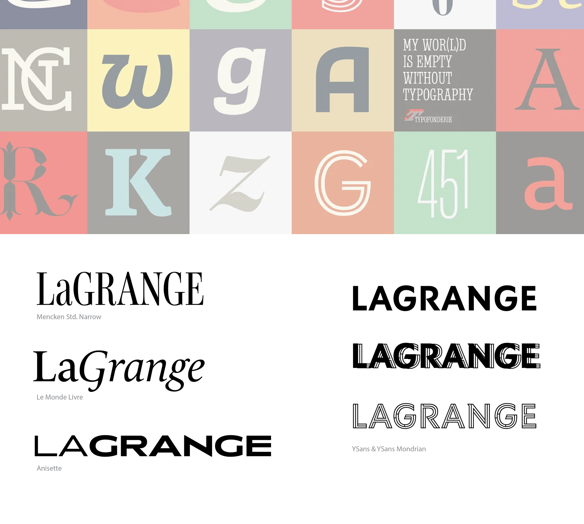
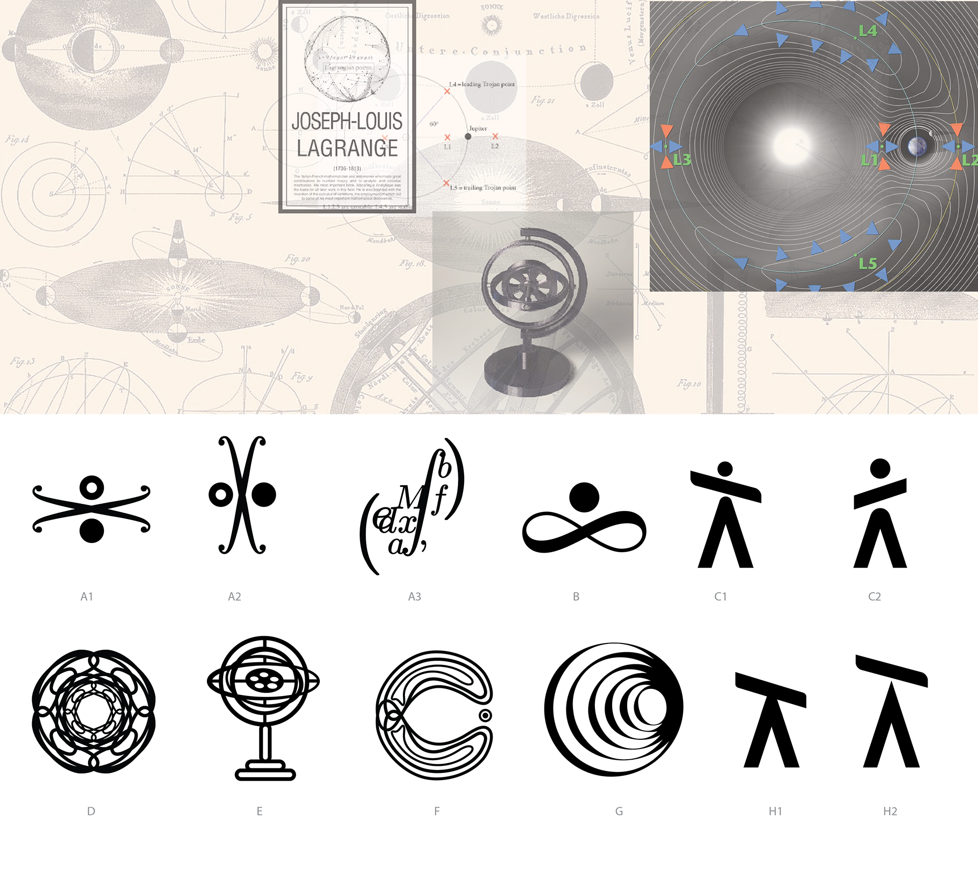
Using their typography preferences as well as suggesting some specifically French styles from the type foundry, Typofonderie, we jumped in. I began with some mathematical logos as well as abstract shapes vaguely representing some of the concepts attributed to their namesake, the Italian-French mathematician and astronomer Joseph-Louis Lagrange.
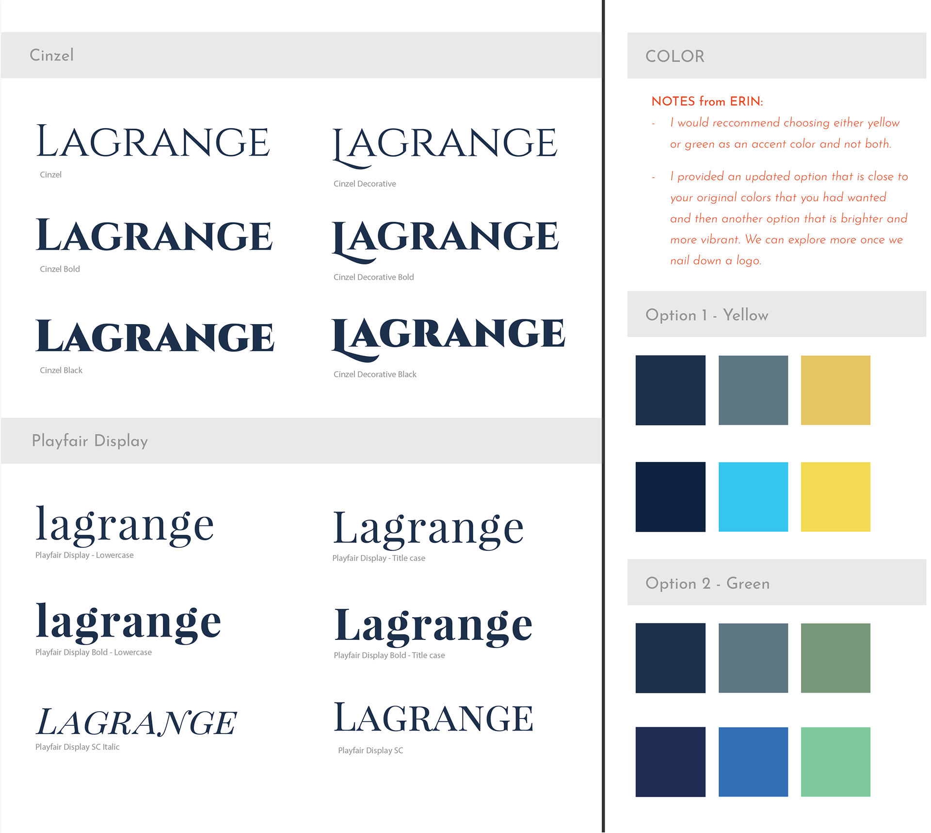
TRUSTING the CLIENT'S PREFERENCES
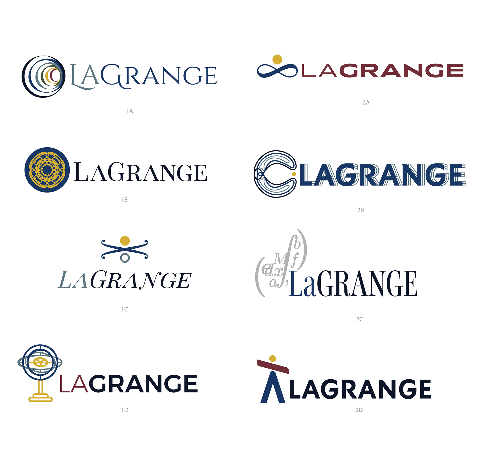
I learned that Typofonderie is used excessively in France (unfortunately, I've never been), and they wanted to stick with exploring their initial type preferences, Playfair Display and Cinzel Decorative. They seemed to like the idea of a circular logo as well, so we investigated some new shapes and ideas.
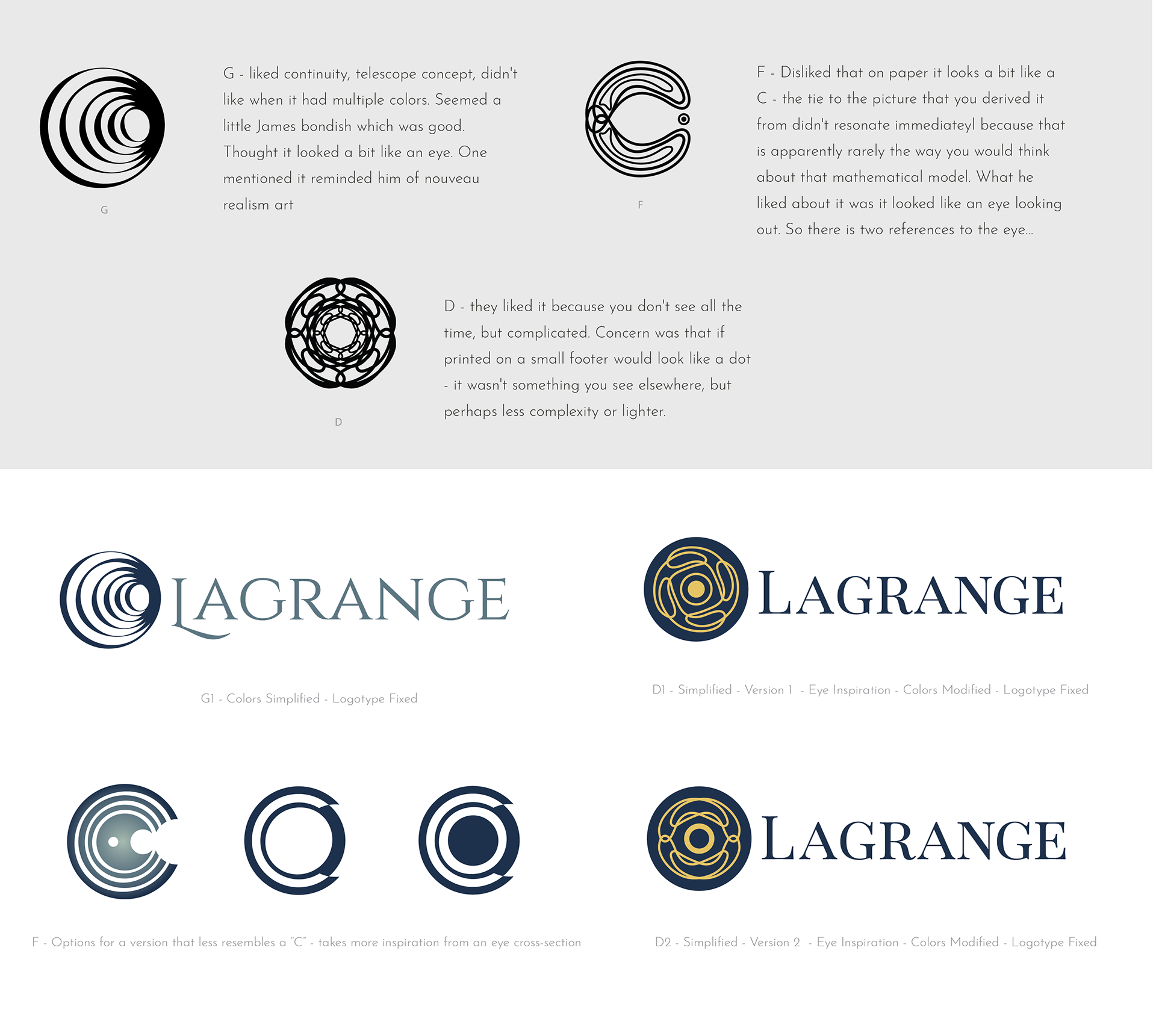
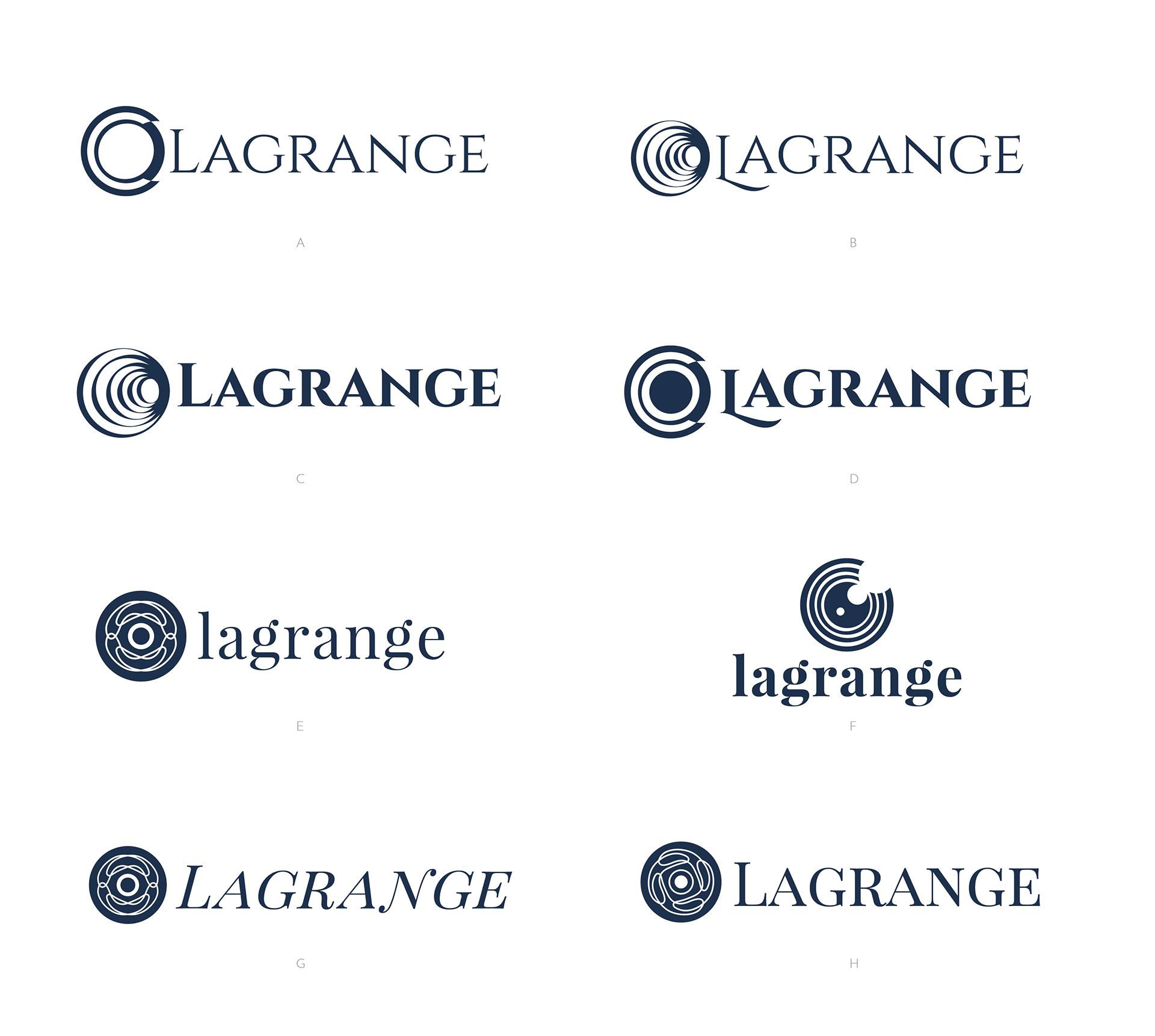

THE FINAL CHOICE
The final choice ended up being surprisingly elegant and more high-fashion than euro- tech-startup. They ended up going with a color palette that is bright while remaining stately and brings an air of sophistication and academic provenance to a brand new company.