NEXBIKES
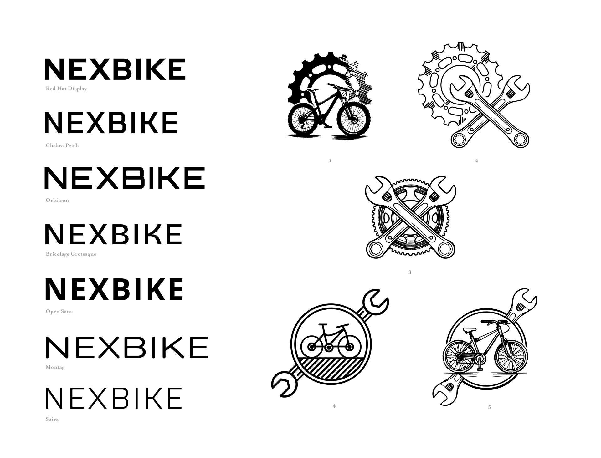
The founder of NexBikes approached me to create their branding and identity. While they had a few rough ideas created by AI, and a color range they wanted to stick with, they were wide open to everything else. We began with a very straightforward option to start with showing literal tools and bikes, and went on from there.
MORE ABSTRACT & BOLD
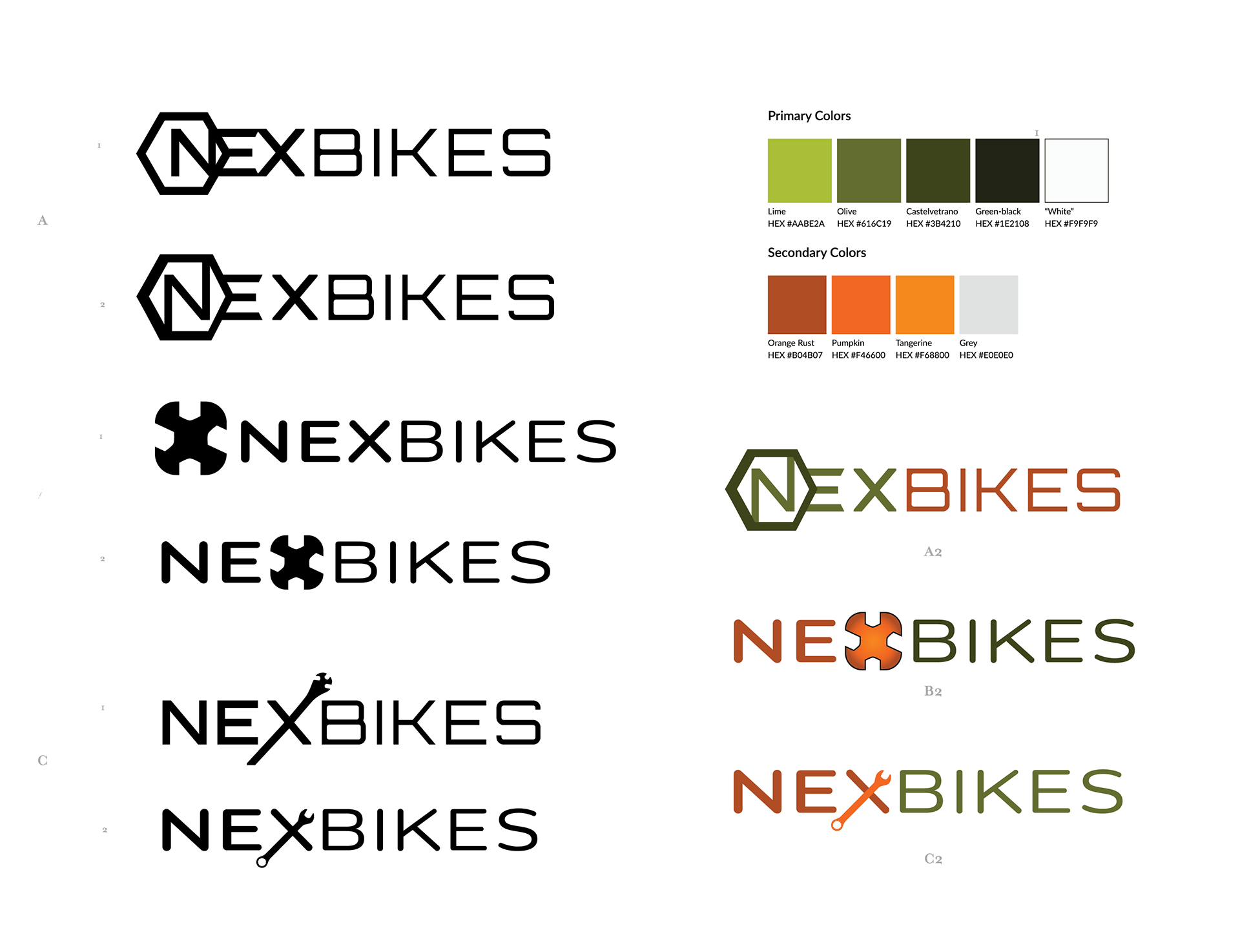
Wanting a more bold and abstract direction, we took some of the basic shapes from the tools and the bike itself to give the brand more something more visually dynamic.

PUSHING COLOR TO FIND A WAY THROUGH
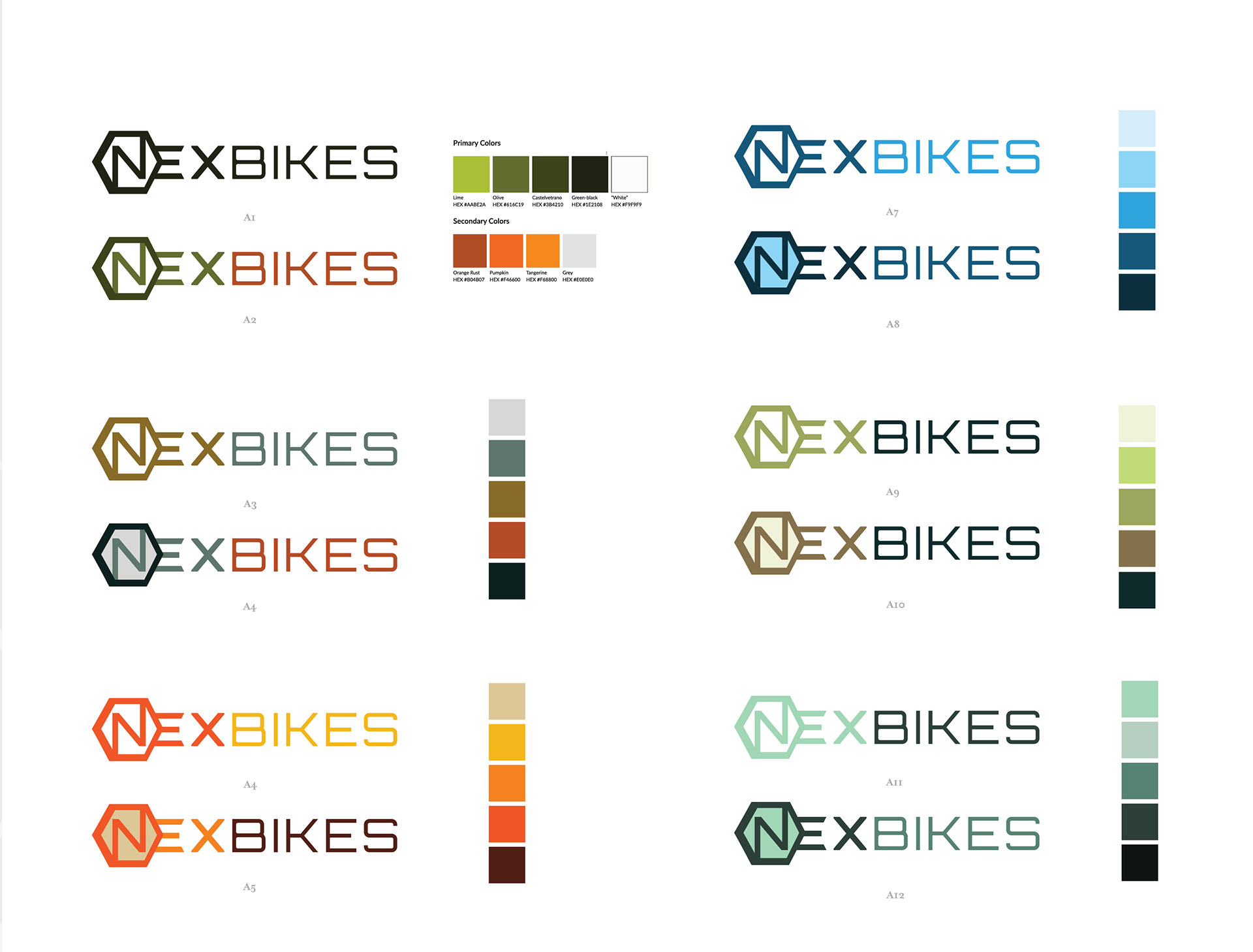
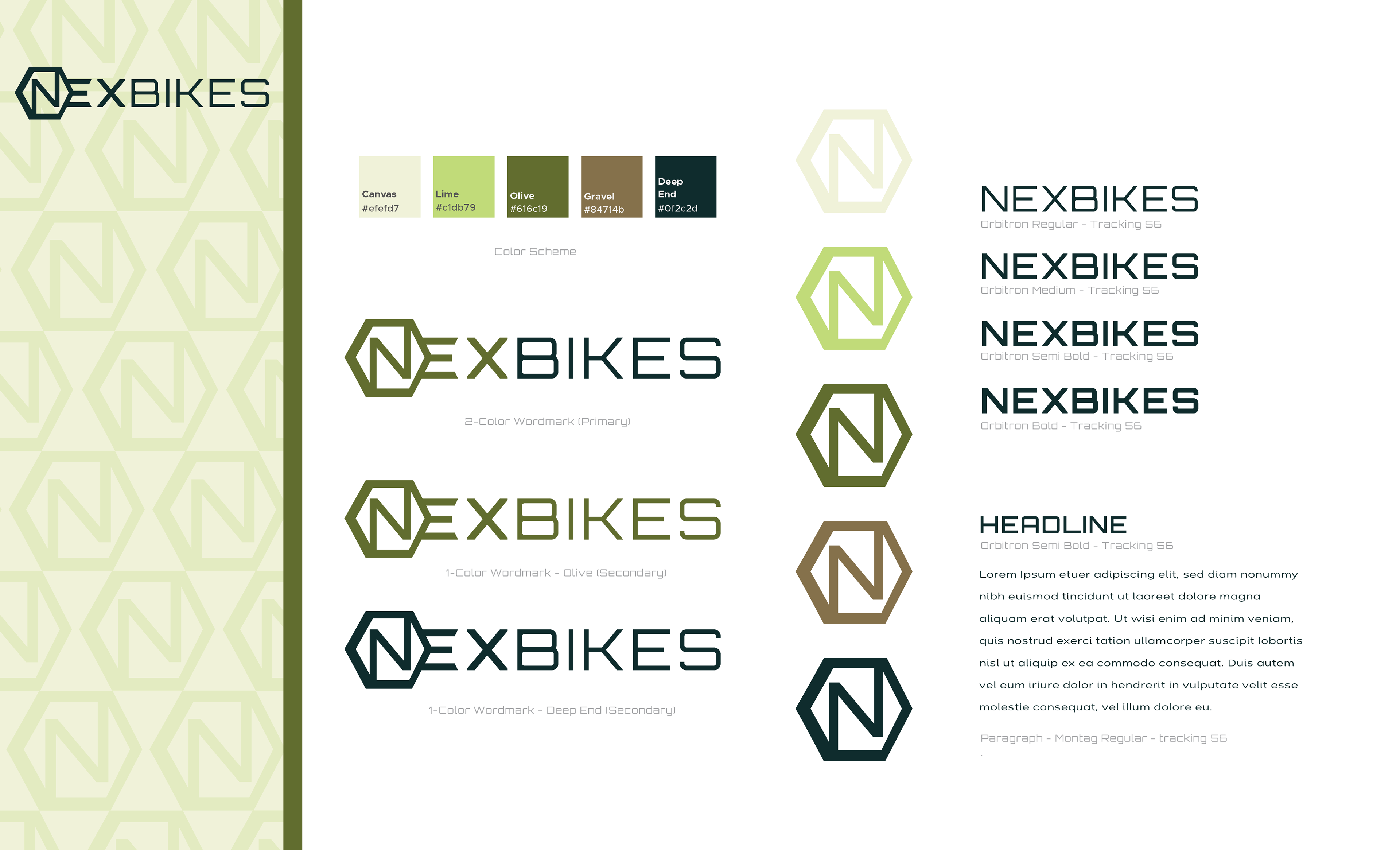
After struggling to find a solution, I suggested that we start to work with color to see if that would help the client realize the direction they wanted to go. Ultimately, that was a success and after a few more rounds of color studies, we ended up with a final brand.
Trusting the Client's Instincts
Color was one of the only things the client was settled on in the beginning, but began to question their initial thoughts. We worked through by trying a multitude of pallets but settled on the original greenish brown scheme.